Written by Ray Masaki
This is somewhat related to my previous post of knowing when to not use a design for your line. I think an extremely important distinction is knowing when something is an awesome piece of artwork, and when something is an awesome t-shirt design. There are many designs that overlap the two areas, but there are others that absolutely do not; not all rectangles are squares. A graphic t-shirt is a form of expression and wearable art, but it doesn’t necessarily mean that if a piece of artwork looks great on paper or the computer, it’ll look equally as good on a t-shirt.
First thing is to consider the audience. Typically, I try to design for myself, so when I’m creating a collection. I have to honestly evaluate if someone like me would wear the t-shirt out in public. We all fall in love with our own labels, so it’s easy to say that you would wear your own stuff out of pride, but it’s important to be able to admit if you wouldn’t actually want to wear something. Again, if it’s something you’re not satisfied with, how can you sell it to your customers? Think about your target audience, and what kind of clothes they are into. Are they into big ass bold prints, or are they into minimal designs? Research is key! Look at other successful brands that inspire you, and see what they are doing correctly. I’m not saying that you should copy another brand, but using another successful brand as a point of comparison and reference is not a bad thing.
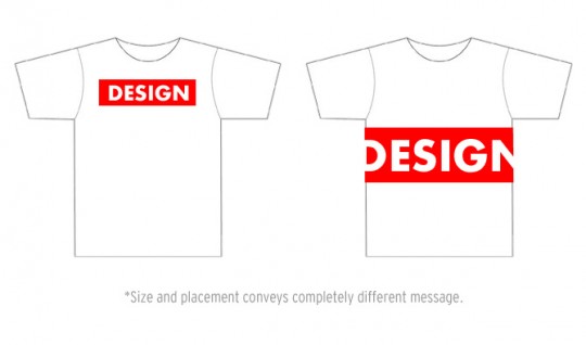
 Another thing I often consider is the composition of a t-shirt. Not composition as in, what is the t-shirt made of, but imagine the t-shirt as a canvas and consider the composition of an image. As a designer or art director, you have to think about the placement and negative space that the design creates. A couple years ago, people were into oversized prints that nearly covered the entire shirt, but is that the case anymore? Print out the design on a piece of paper at its full-size and tape it on to a t-shirt as a mock-up. How does it look and fit? How does it fall on the shirt?
Considering where design elements compositionally fall on a t-shirt is important as well. Say you have a t-shirt design with a bicycle on it. You probably wouldn’t want the two wheels to accentuate the nipples of whoever is wearing it. Additionally, I find it awkward when prints are placed too low, and accentuate the stomach and torso of the person wearing it, rather than the chest. Obviously, if that’s your intention, then go for it, but generally, most people like having t-shirt designs on the upper portion of the shirt rather than the lower portion.
Also think about the scalability of the design. Unless you’re making multiple screens for multiple sizes, most brands will be creating one screen regardless of the size of the shirt. Ideally, you want the design to look just as good as it does on a small shirt as it does on an extra large. I find that a lot of people design to fit on a medium shirt, because that’s relatively neutral, but sometimes that makes the design look too big and bleed off the edges on a size small and the design looks too small on an extra large. Additionally, if you’re considering alternative placements of the design, rather than just a chest print, think of how the negative space is activated. If the design is placed on the lower portion of the shirt, it sends a different message. If you’re going to place something in the corner of a shirt, make sure it’s intentional, and not just to be different.
I think the best thing to do is get a lot of different opinions on your stuff from people that can be honest with you. Try to be as objective as you can when you look at your own brand, and don’t be offended if someone gives you harsh criticism. Building a brand is all about evolving; don’t be close-minded. I think my best advice on the subject of choosing t-shirt designs to print would be to not fall in love with anything, and have an open mind about editing, or even getting rid of designs that don’t work.


