Art Doesn’t Sell
by Jimiyo
In my experience as a designer and curator, there is a truth about the apparel world that has become apparent. If my hunch is correct, this probably spans the whole world of art:
Artsy fartsy doesn’t sell in a mass consumer market.
I don’t wish to discourage any artist from designing in their own voice, but typically, people enjoy simplicity; generic ideas, easily understood and recognizable.
By artsy farty, I am referring to esoteric ideas, themes, and execution.
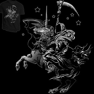 For example, my best selling shirt at shirt.woot.com was Death on a Pale White Unicorn.
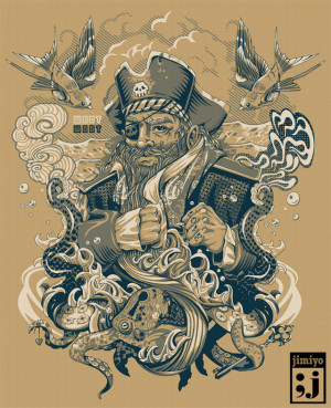
Whereas Death took only 1.5 hours, the piece over which I labored most, Plunder All, was received with only mild enthusiasm by the shirt.woot market.
Whereas Death on a Unicorn is easily understood, “haha, I get it, its… Death on a Unicorn, plain and simple, but whats this pirate about? He has brass knuckles but he has Love tattooed on his fist? And whats with the octopus with the keyhole in the head?”
One may argue that shirt.woot is a vacuum in which the preferences of the consumers are very specific, but this is not the case.
In most avenues I’ve observed, there is rarely an exception.
Teefury started out attempting to be like their sister company Designbyhumans by starting out selling very artistic designs, then over time, the market tended to gravitate towards a Threadless-y Woot-y genre but uniquely Teefury-y.
It seems every business tries to dictate it’s theorectical market, but eventually the consumers from the web will eventually put them into a niche.
At Teefury, since we sell a different shirt every 24 hours, we still have a wide selection of genres we offer, but the obvious winners are pop culture related.
I’ve sold over a dozen shirts through Teefury. In the beginning, I started with artistic designs which took hours to create, and years of refining my skillset.
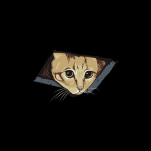
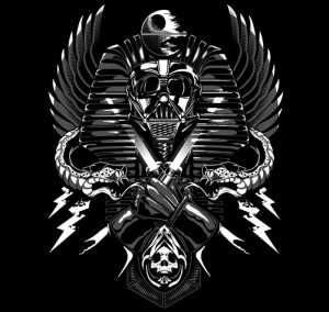
But to date, wonder what’s been my best seller? Ceiling Cat and Darth Tut. Both pop culture references.
What made my artsty fartsy designs fail? Frankly, unless you are in a niche market like Design By Humans, the majority of the population does not have the palette or affinity for esoteric expressions. They simply don’t have the ability or desire to understand a different language.
We are still very much like animals. We still exhibit the fight or flight tendencies in our decision making. We desire social validation and acceptance as community beings so if you apply this theory to products, we want a product that communicates a positive and acceptable message to the rest of the world. We don’t want to scare anyone into thinking we are different.
To wear something that is difficult or even unable to be understood, you might as well be wearing something with a foreign alien language.
We live in a world of symbols. Male/Female bathroom signs are universally understood. The color red, a sign of urgency, skulls typically represent death, etc.
As artists, we can help to create new symbols, but we must teach the world first before they understand it and are at ease with it. So there are two paths.
- Design using symbols that already exist.
- Be the forerunner in defining a new set of symbols, or way of expression, until it becomes accepted, if ever.
The latter is the true artist’s journey, so it is most difficult.
But it seems, that once you define a way of expression, you will have defined your niche, so you can rarely deviate from it once settled into popularity.
BTW, did you know that even with gallery art, the top selling designs are typically generic? Landscapes, abstracts, dogs, and portraits.
So what should you design to be successful?
It depends on your market, but typically
- Look at trends. If you observe enough of the market, you will see consistency, an affinity for certain topics, or specific design aesthetics.
- Include pop culture references. It’s a no brainer for Marc Ecko and Adidas to be partnering with Lucas Films to create products that are Star Wars related. Star Wars is widely understood and enjoyed.
Immediately, when people see the symbols or imagery related to Star Wars, cha-ching. You know it’s $$$$ MONEY $$$$.
If you look at Threadless, you will see alot of other topics that are pop culture/cult following related products.
Video games, zombies, tv/movies, etc.
Piggy-backing on something that’s already popular is the easiest route to getting sales, and attention.
There is a legal issue here. You must parody, or coyly design in a manner in which will allow you to skirt copyright infringement issues. Thankfully, parody is a route.
3. Keep it simple stupid. Don’t deviate too far from the normal way of expressing ideas, and don’t be complicated in artistic expression. Solid low color designs are king. You want to create a design in which, someone walking by in a second understands what they are looking at. This is related to symbols. Symbols are simple images. Just as we recognize a smiley face with a cirle, two dots and a semi circular line, you want your image to be almost just as simple.
*** Addendum by @Hydro74 Twitter
4. Emulate popular styles/trends. “uniqueness is rare and not demanded by consumers or companies thus emulate what sells with a splash of creative twist.”
…..
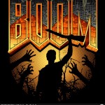
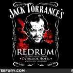
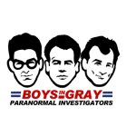
Recently, these are a few submissions I’ve seen at different sites which are obvious winners if they are printed. These are full of win. Obviously, it doesn’t take a expert to recognize them as good sellers.
Although, the skills exemplified by these pieces are professional, I would chance to say that, concepts sell most shirts, so these could have been done by a crappy artist, and they would still sell.
…..
This is the way of the world peeps.
One of the only places I’ve been successful with my own brand of art has been Designbyhumans.com, as it’s market gravitates to being somewhat esoteric and artsy fartsy. It’s built its consumer base as such, but if you notice the shirt of the weeks/months, you will also notice that it’s not necessarily the most artistic designs that win. It’s mostly allovers, abstract designs, and designs that have a wide appeal by being mildly trendy, but not overly similar to trends already existent in the apparel market.
It doesn’t necessarily take extraordinary artistic ability to win.

